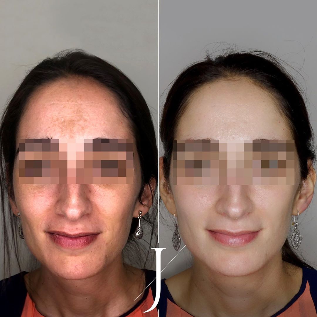
MELASMA

Dermatología · Pigmentación de la piel

Tratamiento del melasma

Valoración dermatológica para determinar el origen del melasma y mejorar el tono de tu piel con un plan combinado.

Pide cita sin compromiso
Tratamiento dermatológico

Controlamos el melasma y mejoramos el tono de tu piel

El melasma es una alteración de la pigmentación de la piel que provoca la aparición de manchas oscuras en el rostro, especialmente en mujeres.

En Clínica Alejandría realizamos una valoración dermatológica para determinar el origen del melasma y establecer un tratamiento adecuado para mejorar el tono de la piel.

¿Qué es el melasma?

El melasma es un tipo de hiperpigmentación crónica que aparece principalmente en el rostro. Las manchas suelen localizarse en:

01Mejillas
02Frente
03Labio superior
04Nariz

¿Por qué aparece el melasma?

El melasma suele estar relacionado con:

  • Cambios hormonales
  • Exposición solar
  • Predisposición genética
  • Embarazo o uso de anticonceptivos hormonales

Tratamiento dermatológico del melasma

El tratamiento del melasma suele requerir una combinación de diferentes estrategias:

01

Tratamientos despigmentantes

02

Procedimientos dermatológicos

03

Protección solar estricta

Preguntas frecuentes

Resolvemos tus dudas

El melasma está relacionado principalmente con cambios hormonales, mientras que las manchas solares aparecen por la exposición al sol.
El melasma puede mejorar con tratamiento, aunque en algunos casos puede reaparecer.
Sí, la radiación solar es uno de los principales factores que lo agravan.
Los tratamientos pueden incluir productos despigmentantes, procedimientos dermatológicos y protección solar.
Solicita información en Valencia

Pide tu cita de dermatología sin compromiso.

Rellena el formulario y nuestro equipo de dermatología valorará tu caso para ofrecerte el plan más adecuado.

C/ Sorní 12, Bajo — 46004 Valencia
961 561 111 ·  WhatsApp 634 517 000
Lunes a Viernes, 10:00–19:00h
Escríbenos
formulario general

Melasma

Comparta sus opiniones

Select one of the portfolio styles.
Note: If you change the portfolio item type, you must click Update/Publish button in order to view item specific options.

Set the alignment of description block that contains item details.

Set the description width (columns) to occupy in item page.

Set placement for gallery images.

Stick gallery photos to the top of page.

Make description container sticky when scrolling down the page.

Enable this option if you want to use masonry layout for gallery items which helps ordering the images, leaving no extra gaps.

One line title to describe the item (optional).

Enable custom navigation (prev/next) links for this portfolio item.

Set custom "previous" link for this portfolio item. (Optional)

Set custom "next" link for this portfolio item. (Optional)

Enter custom URL to replace the default portfolio archive URL (Optional)

Usually written "Launch website"

Website when users click in Launch Link (if not given will not be visible to the user).
Hint: If you want to disable clicking for this item, just type # in this field, and select Redirect to Link URL (Project URL) value in Item Linking.

Open in new tab or window when user clicks in link.

Apart from default item single page you can send users to the external source url (optional)

Add custom checklists for example the services you have finished, tasks done, etc.

1

Title to describe the checklist items.

Enter one task per line, as many as you want.

Select columns per row for this checklist entry.

Choose the effect to show the item images when they appear in viewport.

You can either set default image spacing or remove it (merge images).

Set image captions position for gallery images.

px

Select all images you want to show for this portfolio item.

Add New
Haz click en el botón "Add New" debajo para comenzar a crear tu esquema
0 Image (Image) Desactivado

Image that will be shown

Enter a predefined image size

Columns for image relative to container

0 Images Slider (Images Slider) Desactivado

Enter a predefined image size

Set the number of seconds to auto rotate the images

Columns for image relative to container

0 Comparison Images (Comparison Images) Desactivado

Assign first image to compare (after)

Assign second image to compare (before)

Enter a predefined image size

Columns for image relative to container

0 YouTube Video (YouTube Video) Desactivado

Enter YouTube video URL

Default is used 16:9

You can assign video thumbnail (optional)

Start playing video when page loads

Replay video over and over

Columns for image relative to container

0 Vimeo Video (Vimeo Video) Desactivado

Enter Vimeo video URL

Default is used 16:9

Start playing video when page loads

Replay video over and over

Columns for image relative to container

0 Self-Hosted Video (Self-Hosted Video) Desactivado

Upload your own video or select from gallery

Nombre del archivo:

Tamaño del archivo:

Default is used 16:9

You can assign video thumbnail (optional)

Start playing video when page loads

Replay video over and over

Columns for image relative to container

0 Text Quote (Text Quote) Desactivado

Enter the quote text to display in portfolio gallery

You may or may not include author name for this quote

Columns for image relative to container

0 HTML (HTML) Desactivado

You can also use shortcodes in this field

Columns for image relative to container

Assign self hosted video as featured video of this portfolio item. Adding featured video will replace Featured Image.

Select MP4, OGG or WEBM file types.

Nombre del archivo:

Tamaño del archivo:

If set to autoplay, video will be muted and auto play when visible on viewport.

Toggle audio output of the video. If "Autoplay" is on, the video will be muted automatically.

Show video controls such as play button, volume control and progress bar. If checked, hover layer will not be shown.

Loop video infinitely.

Set header position (logo and menu).

If Header Position is set to "Over the Content" this setting will take effect. Unit is Pixels

px

Extend header container to the browser edge.

Apply custom header styling for this page.

Empty settings will be ignored.

PX
PX
PX

Show or hide page heading title. Note that this setting may not be supported for some pages.

Use this post title or shown your custom title.

Enter your custom page heading title

Use post content as description or enter custom description.

Enter your custom page heading description here. (Optional)

Use custom logo for this page only.

You can the set maximum width in pixels for the uploaded logo, mostly used when you use upload retina (@2x) logo. (Optional)

px

You can enable or disable sticky header on this page only.

Use custom logo for sticky header in this page only.

Empty settings will be ignored.

PX
PX
PX
PX
PX
PX
PX

Show or hide footer on this specific page.

You can overwrite the footer type for this page/post only.

Set custom container width for this page.

Set maximum container width.

PX

Checking this option will overwrite container width value.

Override breadcrumb settings for this current page. Breadcrumb NavXT plugin must be installed and active.

Set custom background color. Leave empty to inherit the value from Theme Options.

Set custom text color. Leave empty to inherit the value from Theme Options.

Set custom border color. Leave empty to inherit the value from Theme Options.

Set custom border type. Leave empty to inherit the value from Theme Options.

Set custom border radius (optional).

px

Set custom top margin (optional).

px

Set custom bottom margin (optional).

px

Set text alignment of breadcrumb trail.

You can set custom layer hover color for this portfolio item specifically. (Optional)

Set hover effect style for this item only. (Optional)

Set initial state for hover layer. (Optional)

Apply custom CSS only for this page.
Note: You don't need to wrap it with style tags (HTML is not allowed in this field).